The Squircle Design Philosophy: Why Nokia N9 Icons Still Look Modern
In the world of design, some shapes are temporary, and some are forever. When the Nokia N9 launched in 2011, it introduced the concept of “Squircle” icons. Today, almost 15 years later, these icons still feel more premium and “fluid” than modern Android skins and iOS.
What exactly is a Squircle? (Math meets Art)
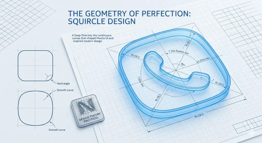
We usually see squares with rounded corners, but Squircle (Square + Circle) is different.
The Hard Angle vs The Smooth Curve: Where a straight line ends and a curve begins in a simple rounded square, the human eye perceives a slight “jerk” or “tangent.”
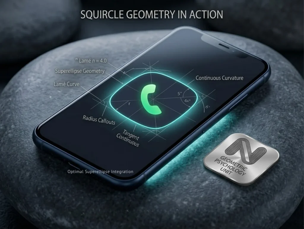
Continuous Curvature: The MeeGo icons used the formula n=4 (Lamé curve), which contains no straight lines. The entire icon is a continuous curve, soothing the eye. This is why these icons feel “organic” and “natural.”
The Psychology of Softness
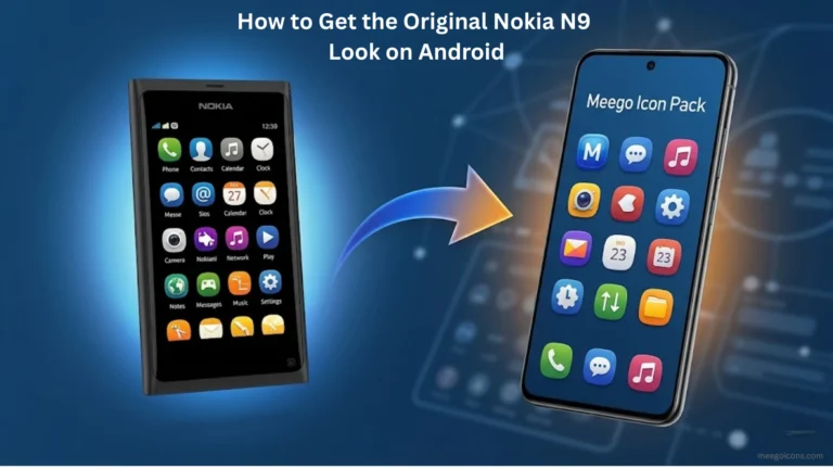
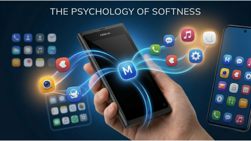
Nokia’s aim was to connect software with hardware. The N9’s body was made of “Polycarbonate,” which had no sharp edges. When software icons were also created using the same squircle geometry, users felt as if the screen and hardware were part of the same body.
Google’s Material Design and Apple’s modern iOS icons also adopted this squircle philosophy, but MeeGo’s “squircle-to-icon ratio” is still considered superior.
The Psychology of Softness: Why Our Brain Trusts Squircles
The human brain instinctively perceives “sharp corners” as a threat. There are no perfect squares anywhere in nature—whether it’s a stone in the river or a tree leaf, everything has an organic flow. The Avoidance Response: In psychology, there’s a concept called “Sharp Object Avoidance.” When we see sharp corners, our amygdala (the brain’s fear center) is slightly triggered.
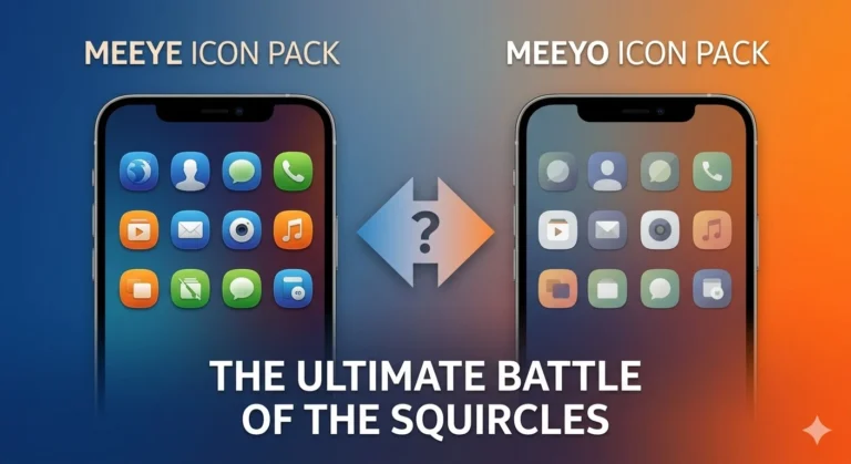
MeeGo’s Approach: The Nokia N9’s icons (Meeye and Meeyo)appear “friendly” because they don’t have a “start” or “stop” point. They’re a continuous curve that creates a sense of calm. When users look at their screen, they don’t feel like technology, but rather like an “organic tool.”
Modern Adaptation: Did Apple & Google Copy MeeGo?
The Squircle design that Nokia introduced in 2011 has become the industry standard.
Apple (iOS): After iOS 7, Apple changed its icons to “Apple’s Squircle” (superellipse). If you look carefully, the curve of Apple’s icons is very similar to the Nokia N9.
Samsung (One UI): Samsung adopted its “Squircle” icons much later, but their curve is not as “aggressive” as MeeGo’s.
The MeeGo Advantage: The unique aspect of the Nokia N9’s icons was their icon-to-grid ratio. Icons felt “floating” on the screen, whereas icons in modern skins often appear boxy.
Why MeeGo Icons Still Win in 2026
Design experts believe that the Nokia N9 icons are superior to today’s modern flat icons because their depth and squircle geometry have a perfect ratio. These icons don’t just look glued to the screen, but feel like part of the hardware.
If you too want to transform your boring Android setup into this premium design science, you can download and install MeeGo Icon Pack APK, which is optimized for today’s modern smartphones. The true joy of this geometry comes when you see it live on your personal device.